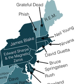
 Paul Lamere's Music Machinery blog has been getting a lot of press over the last couple of days due to a blog post and infographic posted yesterday which explores US regional listening preference using data from a variety of online streaming services. From the blog post:
For this study, I sampled the listening preferences of about a quarter million listeners that have a zip code associated with their account. update: Listener data is drawn from a variety of music streaming services that are powered by The Echo Nest. I aggregated these listeners into regions (state, regional and all-US). To compare regions I look at the top-N most popular artists based upon listener plays in each region and look for artists that have a substantial change in rank between the two regions. These artists are the artists that define the taste for the region. ...
The infographic included with the blog post shows a map of the US with the most distinctive Top-50 artist for each state labeled. With a few exceptions, most of the states have fairly obscure artists listed, but Delaware's artist is Rush. Go Delaware!


